Tuesday, December 28, 2010
Santa's Special Delivery...Beer!
Here is another commercial illustration job from the 90's. It was done for the FX Matt Brewing Co. out of Utica, NY. I was given a very rough sketch of what the client wanted for their gift catalog cover. I gathered good reference and submitted a final sketch for approval before I moved on to the finished painting. Believe it or not they did not even supply me with very good reference for the Schultz & Dooley beer steins. But I was lucky that one of my brothers actually owned those mugs and so I borrowed them and set them up near my drafting table. The piece was completed in two days with gouache 12" x 18". That time frame was very typical of my deadlines for advertising work in those days.
Monday, December 27, 2010
Holiday Lights
I have been involved with an extensive project this past Fall season that required me to dig up and document all of my old illustration jobs. With 30 years behind me, this was a daunting task and I rediscovered some forgotten art. Several of these had a holiday theme which I completed for various clients. Since it is technically still the holiday season, I thought that I would show a few of them this week. This first one was done for General Electric back in the late 80's and like many of these jobs, I had to leave an area "open" for type. This was the GE holiday lighting catalog cover and when it was printed the designer used the dark blue area in the lower left for type. It was done with oil on canvas, approximate size 18" x 24".
Monday, December 13, 2010
Whale of a Demo.
This is another oil painting demo that I did in-class for a Personal Focus course at RIT. I completed this a few weeks ago and it's a portrait of Herman Melville, the author of Moby Dick. I worked on a 12" x 16" canvas with a dark to light and thin to thick approach. Like my last post (Elvis), I worked with larger brushes and talked about thinking in terms of volume and large shapes when depicting hair. Students usually make the mistake of trying to show individual strands of hair when they tackle this problem. You will notice on this portrait of Mr. Melville that not a single strand has been rendered. It is so much fun to work this way and I love the challenge of trying to capture form with the fewest possible brushstrokes.
Saturday, December 4, 2010
The Real Elvis (and not on velvet)
We just started the winter quarter at RIT last week and I realized that I had not posted any of my in-class demos from the Fall quarter. I will show several of these over the next week or so. This is an oil portrait of my all time favorite musical artist. I refer to him as the real Elvis; Elvis Costello. I have been a fan since his very first album which was released way back when I was in college. This is a "wet" oil technique that was completed on a 12 x 16 canvas panel in a few hours.
It is done with large brushes only for a more painterly look ( nothing smaller than a #4 flat hog hair bristle).
Saturday, November 13, 2010
Don't Look Under the Bed!
I do a lot of in- class demos for my illustration classes at RIT and I tend change the theme from time to time. Here are a few examples from a classic monster theme that I was working with a few years ago. Of course I was working from classic Hollywood stills in B & W and I just made up my own backgrounds and color schemes. These were 9 x 12 mixed media demonstrations. The Wolfman and Frankenstein. I used to watch these old movies when I was a little kid. They were originally filmed in the 1930's and 40's but they ran regularly on Saturday afternoon T.V. in the 1960's. Monster Movie Matinee! These creatures gave me nightmares.
Monday, November 1, 2010
Skeleton
I 'm a day late with this post but all of the Halloween activity in the neighborhood last night reminded me of this image. I created this for an issue of Your Big Backyard Magazine back in the late 90's. It ran in the October issue and illustrated a story about skeletons. I completed two other illustrations for the article that depicted animal skeletons. This one was fun! I bought an anatomically correct skeleton costume and my (then eight yr. old) son served as the model. I actually used a younger reference photo for his face. The background figures came from old family Halloween photos. Minnie Mouse is his oldest sister(strangely younger than him in this reference) and the angel and bunny are cousins.
Tuesday, October 19, 2010
Sculpted Weirdos
I have been creating these weird sculptures for a number of years now. I don't really know where they come from since they obviously have no connection to my illustrations or paintings. I do not use any reference and I am not emulating another artist. I do not plan or sketch ideas beforehand. When I work 2-D, I always do thumbnails and carefully consider my compositions. So these sculptures are quite the opposite. They really just emerge from my imagination and I produce them rather quickly. I use wood, foam, sculpey, and found objects to produce them. I never think of a commercial market for this 3-D work; the process is just for me...brain cleaning.
Tuesday, October 12, 2010
2010 Sports HOF Portraits
I just finished this year's portraits for the Greater Syracuse Sports Hall of Fame. I completed nine 9" x 12" portraits of the 2010 inductees. Here are a few of the paintings fresh off the easel. It is a lot of work and the only way that I can make the tight deadline is to work on them all at once. All of them are drawn in first, then under-painting is completed on all of the subjects before I move on. I work them up in layers with mixed media. I gain a certain momentum and rhythm as I progress towards a finish, so I tend to marathon it in my studio for many days. Lots of late nights.
I have completed 186 portraits for the Greater Syracuse Sports Hall of Fame since it's inception in 1987.
Friday, October 1, 2010
Shape Welding
I really should be posting this in the month of March, due to the subject matter, but I'll have moved on to something else by then. There was about a four or five year period where I just happened to be in NYC on St. Patrick's Day. It might have seemed intentional, considering my Irish heritage, but it was really about attending the early spring exhibits at the Society of Illustrators. The Parade was a bonus! It was a real marathon and I'm sure that all participants made sure to load up on liquid carbohydrates. I painted this scene from several bad photos that I had taken. It is a good example of "shape welding". I eliminated the separation of figures and combined all of the dark uniforms to make one large, more interesting, graphic shape. Cheers!
Saturday, September 11, 2010
Oxford Gallery Exhibition
I was invited to exhibit in a group show at the Oxford Gallery in Rochester. The title of the show is Waterway West: A Salute to the Erie Canal. I had done paintings of the Erie Canal in the past but I wanted to create some new images for this show. I biked and walked along the canal to gather some new reference material. I completed all three paintings within about a four or five week time frame. This was very much like an illustration assignment...I had a theme and a deadline for the work to be delivered. The top piece is an oil on canvas (24" x 30"). The subject is an old lock near Kendrick Drive, in Rochester. The middle ( 12 x 16) and bottom (13 x 20) images were completed with gouache...remember?...I'm enjoying the gouache medium again. The Exhibit opened today and runs through October 16.
Friday, September 3, 2010
Re-Discovering Gouache
In my last post I talked about the potential positive effect of taking a break from your normal work routines. This sailboat piece ( 9x 12 ) was done with gouache after having not touched that medium for about two years. I had the usual anxiety that I would not have any idea how to use it...or that the results would be horrendous. On top of that I was doing this as an in-class demo...just for added pressure. But it all comes back and feels fresh to me. I find that I'm using the material in a different fashion and with results that I could not have predicted. As artists we always have to find ways to fight off boredom and at times this can be done by re-visiting materials and methods that have been on the back burner. In this case I'm excited about gouache again.
Sunday, August 22, 2010
Fall Figure Drawing
After taking a few months off from figure drawing I'm getting ready to start up again in a few weeks. It's usually a good thing to stay sharp and to practice drawing and painting with regularity.
I also have discovered that some interesting things can happen to your work when you take a short break from it. As artists we are always thinking about our work...our future work. We can't help it. We look and observe and think about patterns and color and compositions. Taking a short break from actually making art allows for some sub-conscious changes to occur in our approach to work...once we do return to the easel. These changes can be fresh and unexpected and exciting.
Above are a few drawings from the recent past figure drawing sessions. The top piece is 18"x24"
B &W and gray pastels on toned paper (which is wrinkling a bit too much) and the second drawing is of the same model with graphite in a 11" x 14" sketchbook.
Friday, August 13, 2010
New Work Too
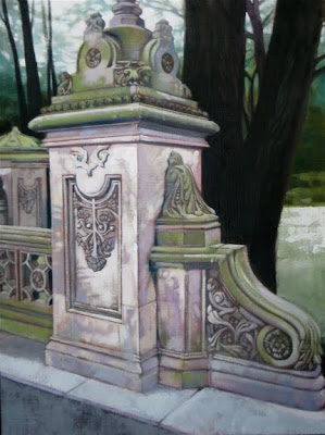
Just in case you were starting to think that all I am doing these days is painting into or over old paintings...I thought that I should post something new. This is a recently completed 18" x 24"oil painting of a decorative stone structure in NYC's Central Park. I'm kind of drawn to these old architectural forms that seem to fit in so nicely with the natural surroundings of the park. Clearly man-made, but it feels like it was always there. I worked from several reference photos that I shot while there a few summers ago. Once I completed the piece, I let it sit in my studio for a few weeks...and then I completely changed the background from my imagination. I find myself doing more of that because I develop a strong opinion of what needs to be done to improve the piece after a bit of time passes. I don't always have that luxury with tight deadlines on my illustration work.
Thursday, August 5, 2010
More Changes...
Here is another painting that I started about eight years ago and just recently worked back into it. This really illustrates the shift in my personal palette! The original version (top) had lots of contrast with bold, "out of the tube" colors. I also worked in some collage...mostly wallpaper scraps, which I was experimenting with at that time. It was too loud for my current preferences, so I toned it down...way down. When I work back into these paintings, I never pull out my original references. I just work from my head on all of the changes. It forces me to be more original and creative.
Friday, July 30, 2010
An Evolving Palette
I have mentioned in earlier posts that I will occasionally work back into older paintings. Sometimes these changes are subtle and at other times quite extensive. A major change within my work over the past few years has been a dramatic shift in my color palette. This change has not been forced or premeditated. It has just happened naturally...I don't know why. I used to see bright colors every where and I usually amped them up even more when I painted. Now I really see most color as a gray tone that leans toward a particular hue. I find it more interesting and real. This is especially evident with the way I handle yellows, blues, and greens. I will also change the composition of some paintings by adding or eliminating elements. Notice how the barn and fieldstone wall disappeared in the above 30" x 40" oil painting. Notice how I toned down some of the color while getting more abstract with the meadow in the foreground.
Thursday, July 22, 2010
Molly and Adam
My first born daughter was married this past weekend, so I thought that I would post recent portraits of the happy couple. Each painting measures 9 x 12 and was completed with oil on canvas. The one of Adam was done about 16 months ago as an in-class demo. The one of Molly was completed in my studio within the past 10 months. I think that I have painted my kids more than any other personal subject matter. When they were little, they would model for my many illustration assignments.
They really were good at it as they always seemed to be able to give me the gesture and expression that the assignment called for. I'll post some of those examples in the near future.
Wednesday, July 7, 2010
Old Time Baseball Demo
This is a portrait of "Home Run" Baker. He was a third baseman for the Philadelphia Athletics in the early 1900's. Just like the hockey player in my last post, these guys all look rough and tough. His expression looks like he may be thinking about a past bean ball incident or murder.
I've done a lot of work for the Baseball Hall of Fame over the years and it's always fun to paint these old time ruffians.
This 9 x 12 mixed media piece was done in-class as a demo with acrylic washes, oil wash, and prismacolor pencils.
Saturday, July 3, 2010
Old Time Hockey Demo
Here's another oil painting demonstration. I really enjoy painting old time hockey and baseball players. Their faces reveal so much. Most of them grew up poor. Semi-pro or professional sports was their way out of poverty. This piece was started and completed in-class this past year for one of my courses at RIT. My references are all B & W. The color comes from experience and research into historical team uniforms. This 12 x 24 painting depicts a 1920's era Boston Bruin defense man in his brown and mustard yellow sweater.
Tuesday, June 22, 2010
Mixed Media Demo
This 9 x 12 piece was painted with a combination of acrylic washes, oil paint, and Prismacolor pencils. The portrait is of one of my all-time sports heros... hockey great, Bobby Orr. This depicts him as an eighteen year old rookie for the Boston Bruins. As artists, we are always looking for challenging subjects. In this case Bobby's brush cut was a bit of a challenge to render. Fun stuff!
Wednesday, June 16, 2010
Combination Creature
This painting started out as an in-class acrylic demo. It sat around, unfinished, in my studio for several months. One night as I was about to clean my palette after an evening of oil painting, I decided to put this on my easel and cover the acrylic with oils. I find myself working back into older paintings more and more. An older piece that you no longer like can serve as a great under-painting for something new. This creature is a combination of a Great Horned Owl, a Grizzly Bear, and a Swallowtail Butterfly.
Sunday, June 13, 2010
Acrylic Stages: Mandrill
This shows one of my in-class demos from under-painting to a near finish. I am using acrylic paints here and you can see that I start out applying it in a monochromatic fashion. I feel like I am "drawing" with the paint at the earliest stage. I establish my mid-tones and darkest darks with several thin layers of acrylic. The next stage shows how I begin to show the form by adding some lights and some color with a more opaque paint application. I really sneak up on things here as the painting progresses, the paint gets thicker and the color gets more saturated. I love the versatility of acrylics. They can be used transparently like watercolor or more opaquely like thick oils. They are ideal for glazing techniques due to the quick drying times.
Monday, June 7, 2010
In-Class Acrylic Demo
I painted this pelican in-class this past school year as I demonstrated how I use acrylics. I played around with acrylic paint, off and on, for probably ten years before I was pleased with the results.
I think that they're actually more difficult to use than oils. This piece was done 11 x 14 on cold press illustration board and I worked from my own photo reference (taken in Naples, Florida).
For the sake of design, I matched the color and stylistic marks of the bird's feathers with the weathered wood.
Monday, May 31, 2010
In-Class Oil Demo
This is an in-class oil demonstration that I painted a few months ago for my Illustration 1 course at RIT. I do a good number of these each year. This one is on 12 x 16 canvas and shows the classic dark to light and thin to thick method. I start with a very limited palette and then add a bit more color as the piece progresses.
Monday, May 24, 2010
Had A Great Fall?
A few years ago I worked on an advertising campaign for a New Jersey law firm. All of the images were based on nursery rhymes and children's book imagery. The top image that you see here (in blue pencil) was one of my sketches for the campaign. The agency chose a different sketch of mine to be completed and subsequently go to print. I finished the job with the client and Ad agency happy...but I always liked this sketch better, so I decided to paint this image as an in-class demonstration for one of my classes at RIT. It shows one of the many ways that I use oil paint.
The center image shows a monochromatic underpainting, and once that is dry, I glaze transparent and semi-opaque color on top.
Friday, May 21, 2010
New Approach...
This is a recently completed 24" x 30" oil painting that represents a slightly different approach for me. In the past whenever I have dealt with architectural subjects, I would have taken the time to do a fairly tight pencil drawing on the canvas before I applied any paint. This would ensure straight lines and technically accurate perspective. With this piece, I jumped right in with the paint and no under-drawing. I was inspired by a few Edward Hopper paintings that I saw last summer at MOMA in NYC. They were part of the permanent collection and I was amazed at his simplified approach. They suggested architectural detail without a lot of rendering.
Friday, May 7, 2010
Two Drawings
Most of my drawings while working from the figure are from poses that will last about an hour.
I usually work initially with graphite in an 11 x 14 sketchbook and then if I like the pose I will have the model repeat it for another forty minutes to an hour. While working the second session, I will change my medium just to keep things fresh and to prevent boredom. The example above shows my first drawing with graphite and the second larger drawing (18 x 24) which was done, in this case, with charcoal and gray value pastels on toned paper. It amazes me sometimes at how quickly the second drawing comes together. This, I believe, is due to the intense observation as well as the aesthetic decisions and thoughts that come about while working on the first sketch.
Monday, May 3, 2010
Plein Air Painting
After my Hudson Valley Workshop experience last summer I continued to work in my sketchbook every week. Usually this was from the model, but occasionally I would go into the field and sketch. The next logical step was to get back into painting on location from nature.
I bought a French Jullian easel and some bug spray and started painting with oils in the classic Plein Air tradition. Here are my first few paintings from that experience. Both are oil on canvas 16 x 20. Total painting time was under three hours each as the lighting changes so rapidly that you must work quickly.
Thursday, April 22, 2010
Workshop Inspiration
After working from the model for a few months, I had the opportunity to attend a workshop in the Hudson Valley which was conducted by the legendary artist Burton Silverman at his summer studio. This really changed my approach to figure drawing! This is one 11 x 14 graphite drawing from that five day workshop. You can see the increased value range and the emphasis on larger simplified shapes. I will post more from the Silverman workshop in the future. Check out Burt Silverman's work at burtonsilverman.com
Sketching again!
About a year ago I started sketching from the live model again. It had been years since I had done this very basic exercise. As an illustrator, I had grown accustomed to using photographic reference for so many assignments...necessary to work within tight deadlines and to sometimes deal with more dynamic poses. But working from life is so much fun and now I'm hooked.
Subscribe to:
Posts (Atom)